
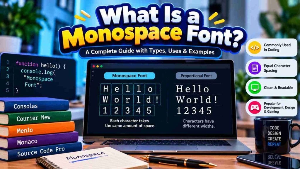

Monospaced typography begins with mechanical necessity: every character occupies equal width, creating fixed widths that preserve vertical alignment. In my work, this design constraint remains useful for code, tables, and technical layouts where order matters.
Today, monospace is a deliberate choice, not a relic of typewriters or early computer terminals. Character spacing, uniform structure, and a technical aesthetic establish clarity across interfaces, documentation, and technical branding without overwhelming most readers.
Table of Contents
What Is Monospace Fonts?

Monospace fonts assign every character the same horizontal space, creating predictable alignment. In practice, this fixed-pitch structure supports uniform character width, equal width, and precise positioning, especially when readability depends on orderly columns across screens.
What makes them distinctive is not decoration but behavior: rigid grid, vertical columns, and dependable consistency let designers inspect individual characters without proportional spacing altering positions. This remains useful in code, terminals, tables, and layouts.
Why Do Monospaced Fonts Exist?
Monospaced fonts exist because early typewriters assigned uniform width to every character, making alignment predictable. That constraint later suited computer programming, where precision and clarity matter when code lines must remain visually organized across screens.
I’ve found the original purpose still explains their value today: coding, columns of data, and fixed widths reduce visual drift, helping readers spot errors and compare information without relying on proportional word shapes for alignment.
Key Characteristics
Monospace fonts give every character identical character width, creating a structured look that keeps columns visually stable. This equal width behavior supports vertical alignment reliably, especially in code, tables, and technical layouts where precision matters.
From Courier to Roboto Mono, these typefaces often show a mechanical tone, consistent spacing, and strong legibility. In practice, I find their fixed spacing reduces visual drift when scanning symbols, numbers, commands, and aligned text.
Also Read: Twitter Font Generator – Make Your Tweets Stand Out With Stylish FontsStyles And Types
Monospace styles vary by structure, spacing, and terminal treatment. A monospaced sans-serif feels clean, while a monospaced serif adds texture; compact capitals and an industrial aesthetic can create a structured interface across modern screens reliably.
Some families use typewriter-inspired serif forms, while others favor true italics, angled terminals, or coding ligatures. I often test each style on actual text first, because a playful twist can still preserve clarity under pressure.
Advantages And Applications
Monospace earns its value through coding efficiency, where aligned code reduces scanning friction and helps developers notice syntax errors. The same fixed rhythm suits technical documentation, command-line instructions, and structured data displays at remarkable speed.
A less obvious advantage appears in design: minimalist branding can give tech companies a clean visual language, while retro design adds nostalgic character. In editorial design, selective use creates distinction without sacrificing clarity or hierarchy.
Coding And Terminals
Developers often choose monospace for lines of code because equal width keeps indentation stable. In code editors, consistent character placement makes brackets, operators, and symbols easier to scan, compare, and debug quickly reliably every day.
Terminal interfaces also benefit from Courier, Source Code Pro, or Inconsolata, especially when logs and fixed-width numbers must align perfectly. From my experience, this technical aesthetic improves visual grouping without distracting programmers during daily work.
Numbers And Finance
In financial data tables, equal-width characters keep digits aligned across statements, invoices, and ledgers. This makes it easier to distinguish columns during reconciliation, especially when totals, decimal places, and account references demand careful visual checking.
With a slashed zero, a numeral 0 cannot be mistaken for uppercase O, reducing confusion in an account code. This design feature helps transaction references stay clear when figures move between finance systems without errors.
Also Read: Disney Font Generator – Turn Your Text Into Magical Disney FontsTechnical Documentation
In technical documentation, fixed spacing makes command examples predictable across lines. I often use a grid structure when explaining APIs, configuration files, and programming syntax, because consistent character positions simplify scanning and comparison during reviews.
For specifications, a typeface with shared characteristics can keep tables, logs, and reference snippets orderly. A restrained sans-serif companion handles prose, while monospace preserves alignment for identifiers, values, timestamps, and technical examples without drift easily.
Branding And Editorial
For branding, monospace lettering can make an editorial identity feel deliberate, especially when font groups establish a consistent aesthetic. Designers can shape horizontal space into a controlled system, keeping layouts minimal but recognizably technical, consistently.
In practice, I pair monospace accents with sans-serif text when proportional fonts handle reading. This preserves functionality while giving a visual style suited to a specific job, such as captions, labels, product notes, or data.
Nostalgic And Retro Design
Monospace typography feels retro because its typewriter style preserves a mechanical texture that many modern interfaces abandoned. In my design work, this classic monospace character quickly establishes nostalgia without sacrificing clarity or practical usability today.
That nostalgic effect becomes sharper when expressive elements, rough texture, and pronounced serifs appear in headings or poster layouts. I have found these choices useful for album covers, portfolios, and interfaces seeking an aged personality.
Top / Popular Monospace Fonts
Commonly recognized choices include Courier New, Consolas, Monaco, Menlo, and Fira Code. Monaco remains distinctive, while modern geometric monospace families can feel cleaner when you need crisp interfaces, code samples, or technical branding with consistent spacing.
For visual work, display monospace can introduce decorative elements, while futuristic branding suits sharper identities. I often pair these with terminal displays or an industrial aesthetic, but check readability across devices first before approving anything.
Also Read: Underline Text GeneratorExplore Monospaced Fonts
Exploring a collection of monospaced typefaces is less about chasing novelty and more about noticing how equal-width characters affect coding, interface labels, and editorial details. My practical preference starts with curated options before unusual choices.
A good store or marketplace can expose unusual families, but expert exploration also means comparing width, specialised punctuation, and multilingual support. I usually test Space Mono and Akkurat Mono before finalizing a project choice.
Monospaced Collection
A Monospaced Collection can combine coding-focused typefaces, editorial options, and retro styles. In practice, I compare spacing, character clarity, and personality before selecting fonts, because equal-width design affects reading rhythm, symbols, and visual balance directly.
Some collections favor serif details, while others use a typewriter or terminal aesthetic. I check multilingual support, multiple languages, and specialised punctuation, since coverage matters when a font moves beyond coding into branding or visualization.
Final Thoughts
In practice, I judge monospaced type by how reliably its legibility survives scanning, especially when similar characters appear together. Clear design details matter more than novelty when people read interfaces, terminals, or technical notes daily.
I also avoid assuming monospace is only for code; a restrained serif option can add character, while titles and highlights may benefit from separation. The strongest results come from matching style, purpose, and reading conditions.
What Is A “Slashed Zero,” And Why Is It Used?
A slashed zero improves differentiation between 0, I, 1, and O, especially in code, where similar letters and symbols reduce misreading symbols during debugging, logging, or terminal work. I use it frequently in daily practice.
Are Monospace Fonts Suitable For Body Text?
Monospace fonts can support body text when alignment and predictability matter, but they are not always comfortable. Large portions of text become harder to scan because every character occupies equal space, weakening word shape recognition.


Pingback: Snapchat Font Generator – Copy & Paste Stylish Fonts